Press and brand
Every file here is outlined, so nothing substitutes a font or shifts on a machine that does not have ours. The rules underneath are short and there are only a few that actually matter.
Logos
All SVG, all paths. There is no live text in any of them, so they render the same whether or not our typeface is installed.



Clear space is the height of the mark, on every side. Nothing else goes inside it — not a tagline, not a partner logo, not the edge of a card. Below 96px wide on screen or 25mm in print, use the mark on its own instead: the aperture closes up and the wordmark stops being legible before it stops being visible.
Rules
There is no long guideline document behind this. If something is not on this page, use your judgement and we will not mind.
Place the SVG as it comes. It carries the correct spacing, which is not the spacing you get by typing the name.
The letterspacing in the supplied file has been adjusted by hand. Retyping it in our typeface produces something close enough to look wrong.
Black on light, white on dark. If a background is busy, put the mark on a plain panel rather than adding a stroke to it.
No gradients, shadows, strokes or glows. No brand colour fills on the wordmark. It reads as black or white and nothing else.
Both marks scale from any corner. If the mark and the wordmark appear together, set them at the same optical size rather than the same pixel height.
Including on an angle for effect. The mark is an aircraft and reading it as one depends on it being level.
One word, capital D, lowercase p. In running text it is Diffport, not DIFFPORT, and never the wordmark image dropped into a sentence.
Camel case is the most common one. The lowercase form only appears in a domain or a handle, where it has no choice.
Colour
Click any swatch to copy its hex. The accent is for one thing on a screen, not for decorating several.
These three appear only where authorship is being shown. Untraced is always hatched and never a solid fill, because it is an absence rather than a third category — the pattern is doing real work and should not be flattened.
Type
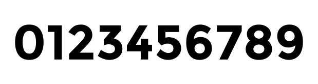
Every specimen below is paths rather than text. Drop them into anything and the letters will be the letters, on any machine, forever.
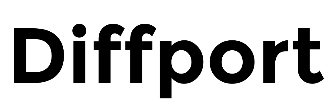
Headings are Montreal. Body text is Plus Jakarta Sans. Anything monospaced is JetBrains Mono. The last two are freely available and we do not redistribute them here — install them from their own sources. Outlines are supplied instead of a font file on purpose: a specimen that cannot substitute is a specimen that cannot go wrong.
Words
Use these as they are, or edit them. We would rather you were accurate than flattering.
Diffport is provenance for code — it tells you which parts of a pull request a machine wrote, and how much review that earns.
GitHub tells you what changed. Diffport tells you who wrote it.
Diffport tags every pull request with its true authorship — which agent, which model, which person — scores the risk, and shows what it does to your database schema. Where no signal is found it reports the code as untraced rather than assuming a person wrote it, and confidence is always reported as the weakest link in the chain rather than the strongest.
Diffport. One word, capital D, lowercase p. Not DiffPort, not Diff Port.
Anything else
Ask and we will make it. A vector in a particular size, a version on an awkward background, or a quote for something you are writing.